Facebook Creator Publishing
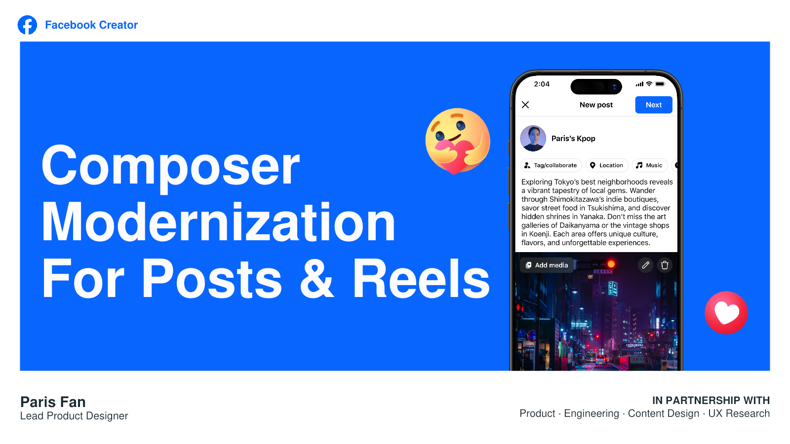
Facebook Composer Modernization
I led a company-wide Composer modernization, establishing scalable design principles and a repeatable feature-placement framework. I later reframed the problem from feature organization to creator workflow, redirecting the strategy toward media-first creation.
The story in 60 seconds
We were solving the problem at the wrong level.
We solved the problem we were asked to solve ✅ → the product still regressed 🤔 → I realized we were solving the wrong level of the problem 💼 → I redirected the strategy 🎯.
The clutter
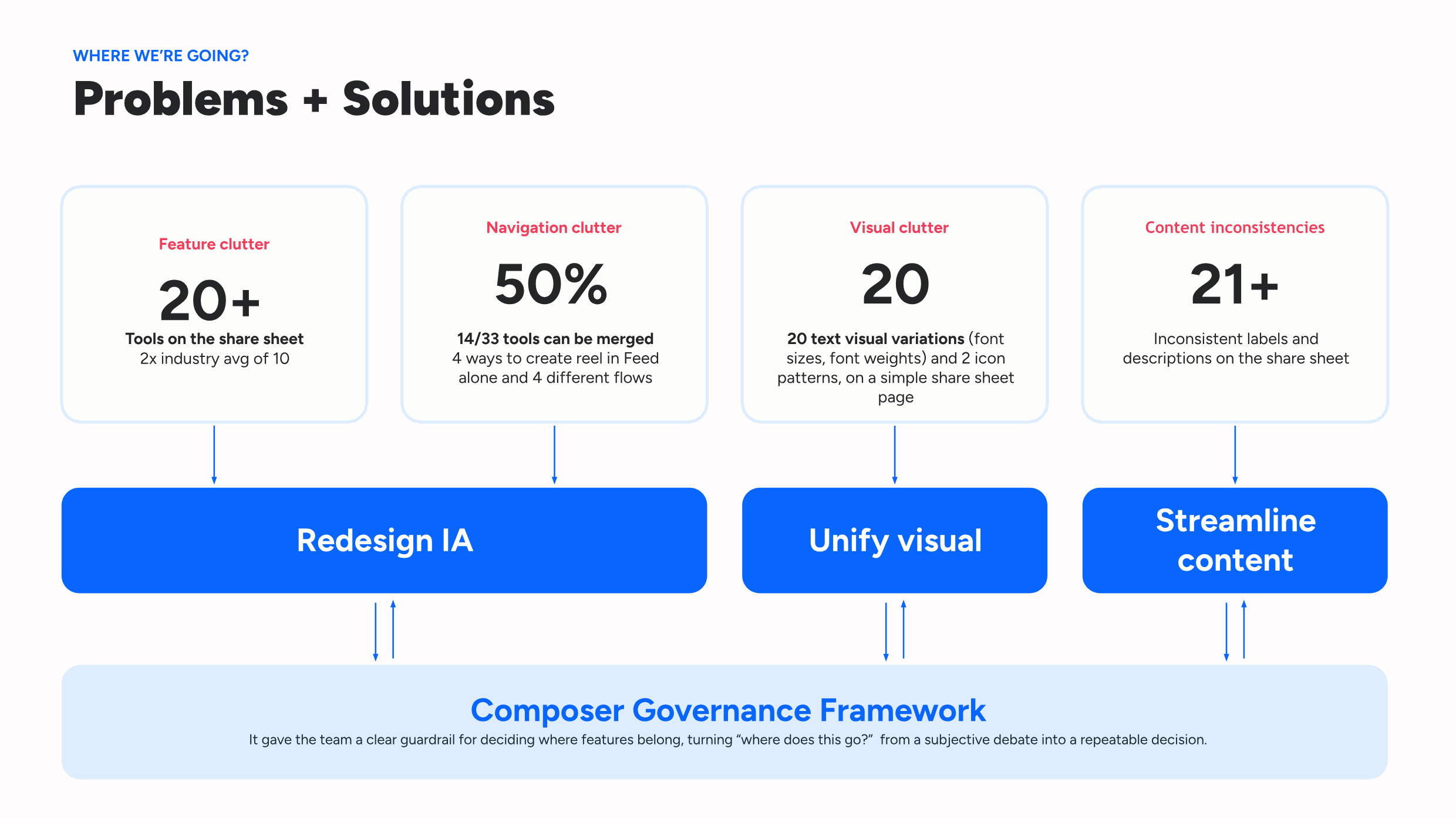
A composer carrying 20+ tools — twice the industry norm — that creators called “overwhelming.” I broke “decluttering” into 4 separately-measurable failure modes and built the Tool Placement Framework to fix them durably.The regression
As I dug in, I realized that we solved how the publishing system organized the features but did not solve how creators use the platform to create and publish content.The media-first pivot
Redirected the flow to rebuild around creation for a media-first model, grounded in data and competitor audit.Outcome & lesson
Shipped a simpler surface. Pivoted directions, gained buy-ins from leadership, and won users’ trust. Built durable governance.The clutter
Turn a subjective complaint into a system the team could act on.
“Declutter the composer” was too broad to guide product decisions. I decomposed it into feature, navigation, visual, and content problems—then tied each problem to a distinct design response.
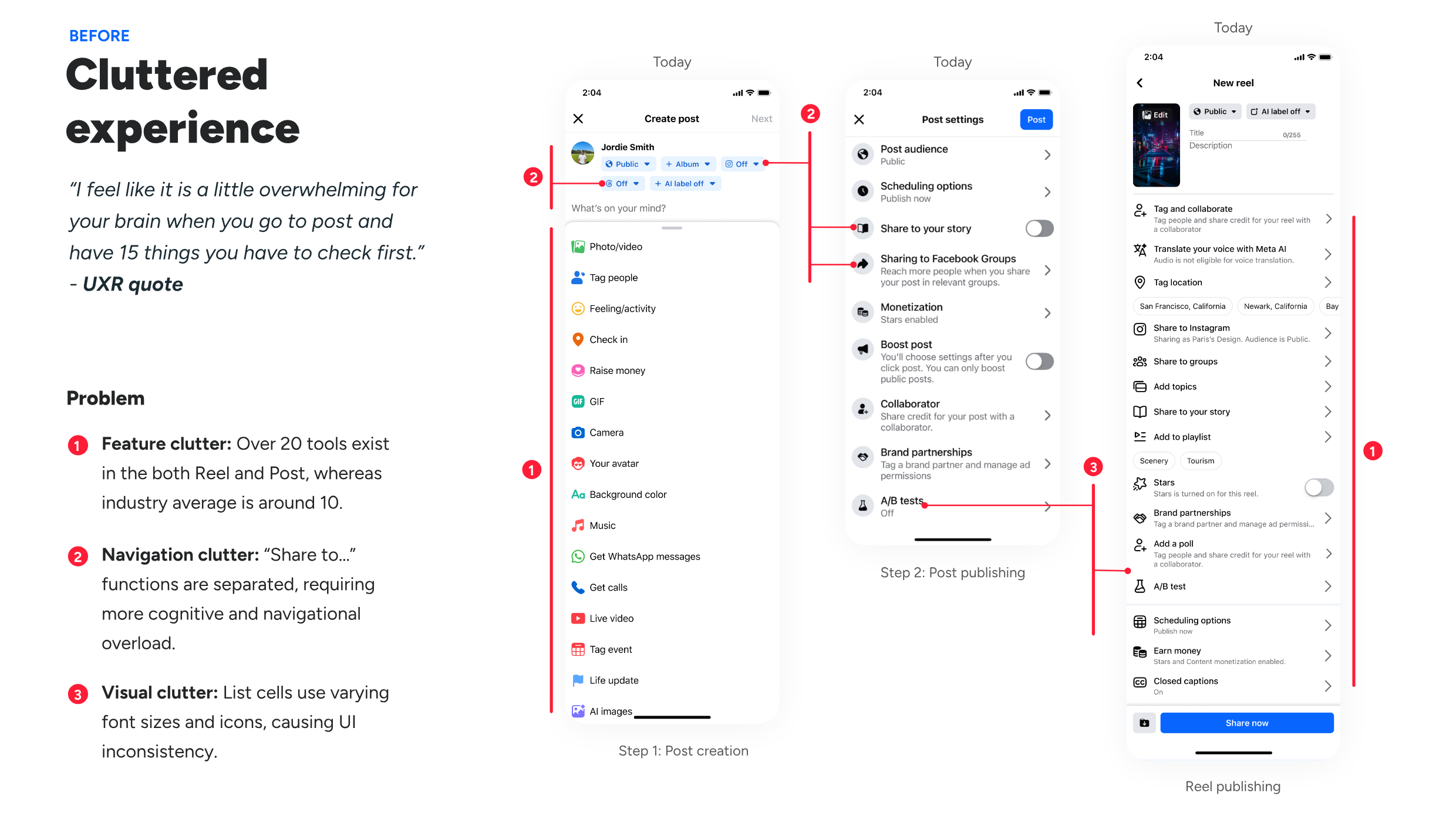
“I feel like it is a little overwhelming for your brain when you go to post and have 15 things you have to check first.”
— Creator research participant
more likely to find the tools they needed
increase in creator satisfaction
But publishing rate and efficiency did not improve.
Why?The regression
Treat the launch result as evidence—not validation.
The redesign solved findability, but the funnel exposed a deeper mismatch. The system was easier to understand while becoming slower and less trustworthy for the creators who relied on it most.
The right path
Make the regression visible.
I did not defend the redesign with satisfaction scores. I traced the drop-offs by content type, creator behavior, and workflow stage, then reframed the problem for product and engineering partners.
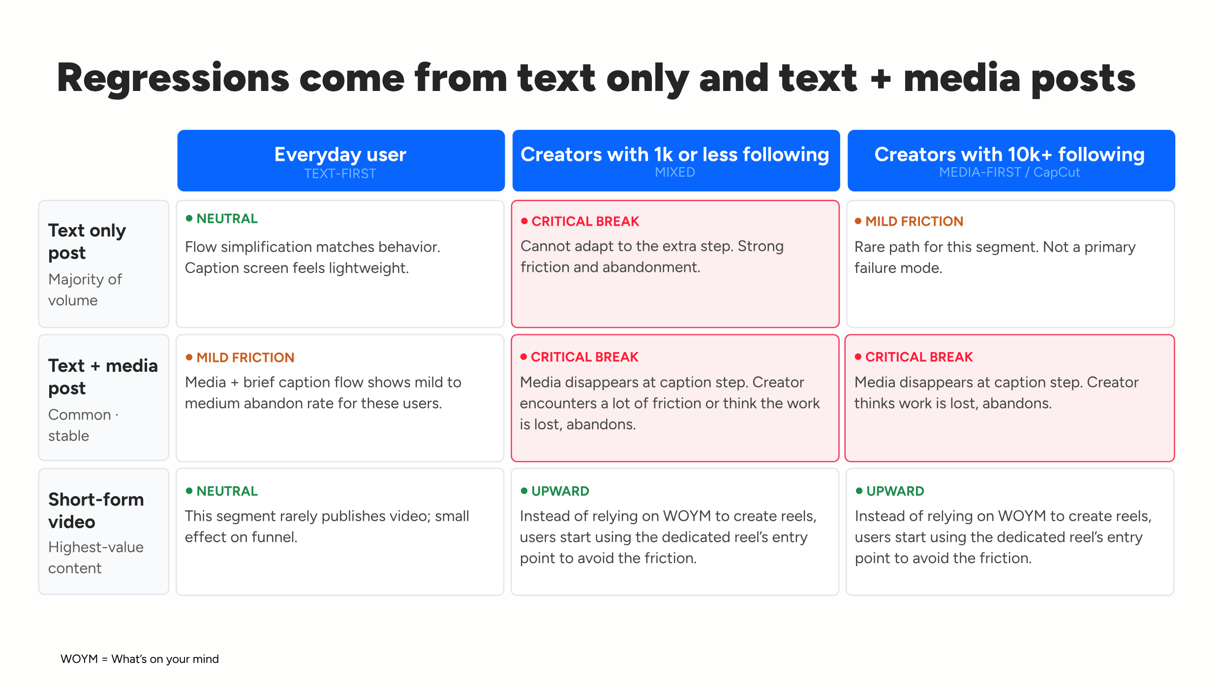
Default mental model
The everyday user
- Text-first and format-stable
- Simple type → publish flow
- Visual context is optional
- Can adapt to a small extra step
Actual high-value user
The creator
- Media-first and workflow-complex
- Switches formats, edits, and returns
- Imports from tools such as CapCut
- Needs media visible while captioning
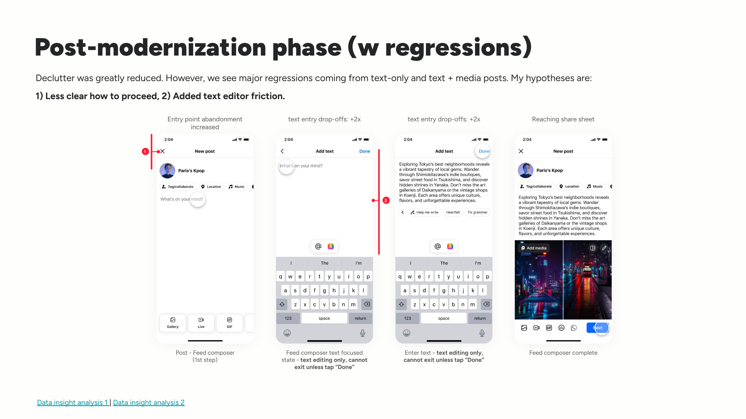
Progress became ambiguous.
CTA placement changed across states, making the next action less predictable and increasing early funnel abandonment.
Captioning broke visual continuity.
A separate text editor added one to two navigation steps and hid the media. Some creators thought their work had been lost and restarted.
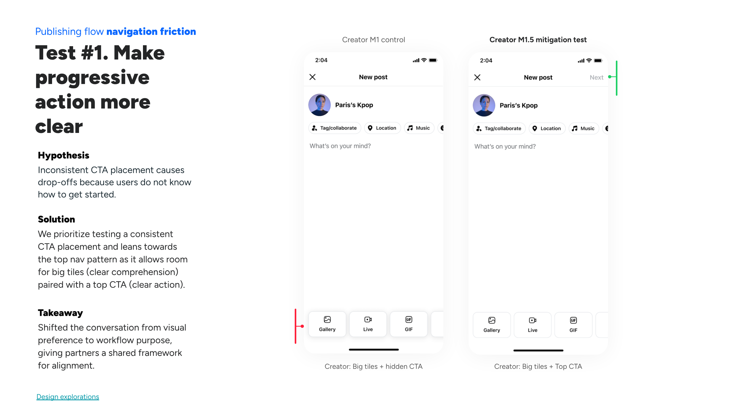
Mitigation test 01
Make progressive action clear.
Prioritize consistent CTA placement, balancing large labeled tools with an unmistakable next step.
Leadership alignmentShifted alignment from visual preference to workflow purpose.
Mitigation test 02
Enable inline text editing.
Remove the separate text page so creators can write while preserving media context and avoid unnecessary navigation.
Product principleFor expert workflows, efficiency can matter more than surface simplicity.
The media-first pivot
Move from fixing friction to changing the product model.
The mitigations addressed immediate funnel problems. The larger opportunity was to stop forcing creators through a text-first system and instead orient the experience around the content they disproportionately create and value.
From
“How should we organize all these features?”
To
“What workflow best supports creation?”
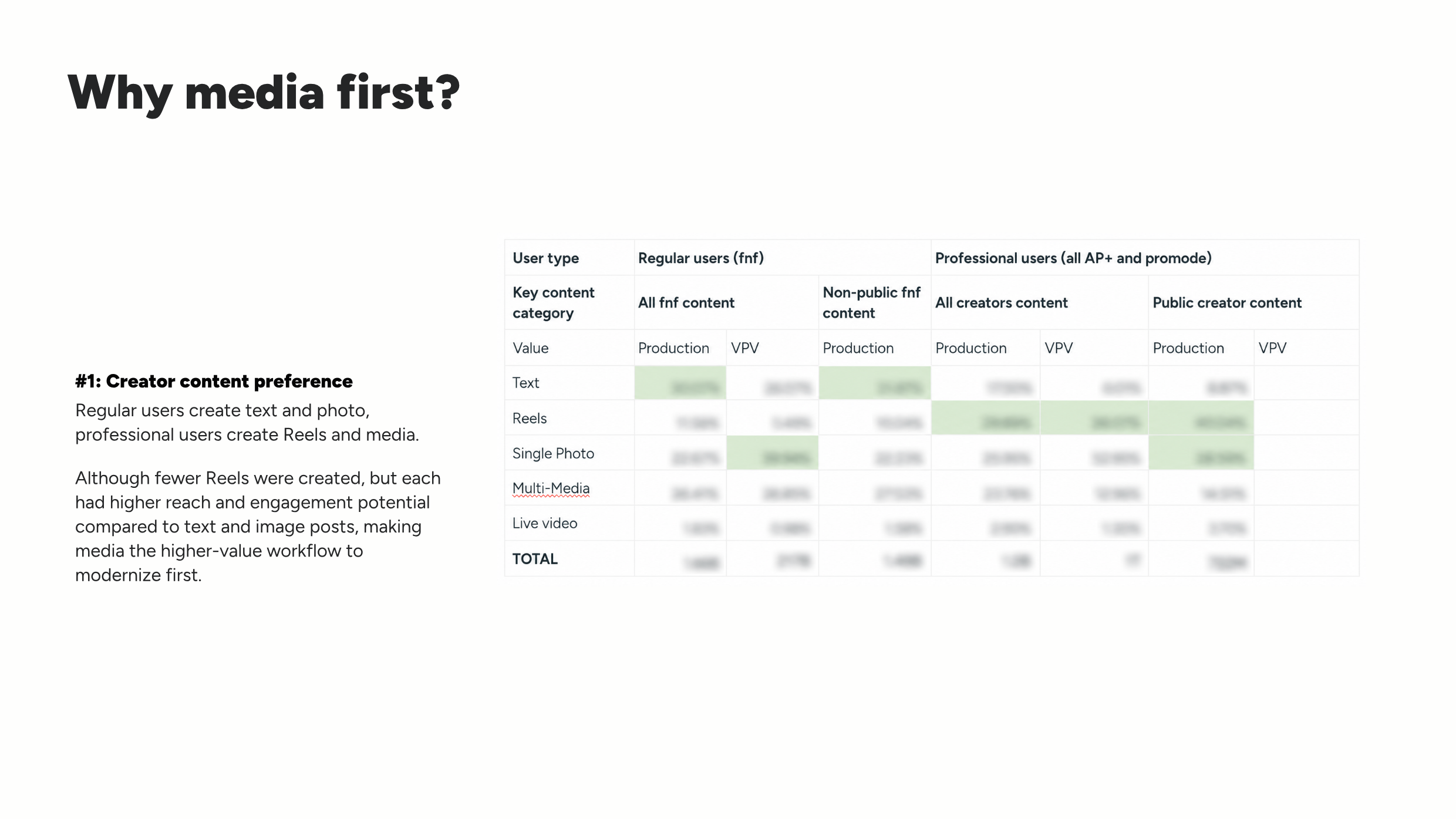
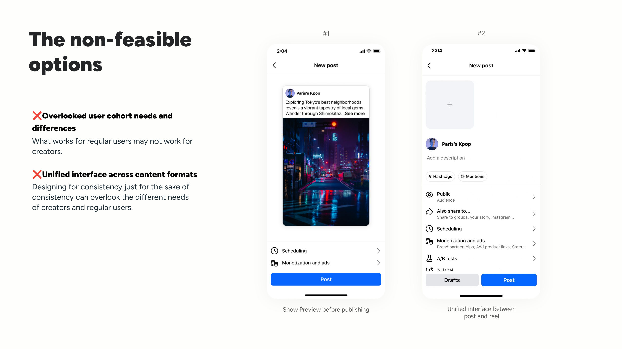
Simplified entry point frictions
Creation had too many starting points, while the entry into rich media was comparatively deprioritized.
Reduced content-creation friction
Creators were using a text-oriented entry point to make video, creating unnecessary format switching and tooling gaps.
Outcome & reflection
The most important result was better decision quality.
The project shipped a clearer publishing surface, established governance, and generated strong usability gains. More importantly, it gave the team the evidence and language to redirect the product around creator workflows rather than defend the first redesign.
A simpler cross-format surface
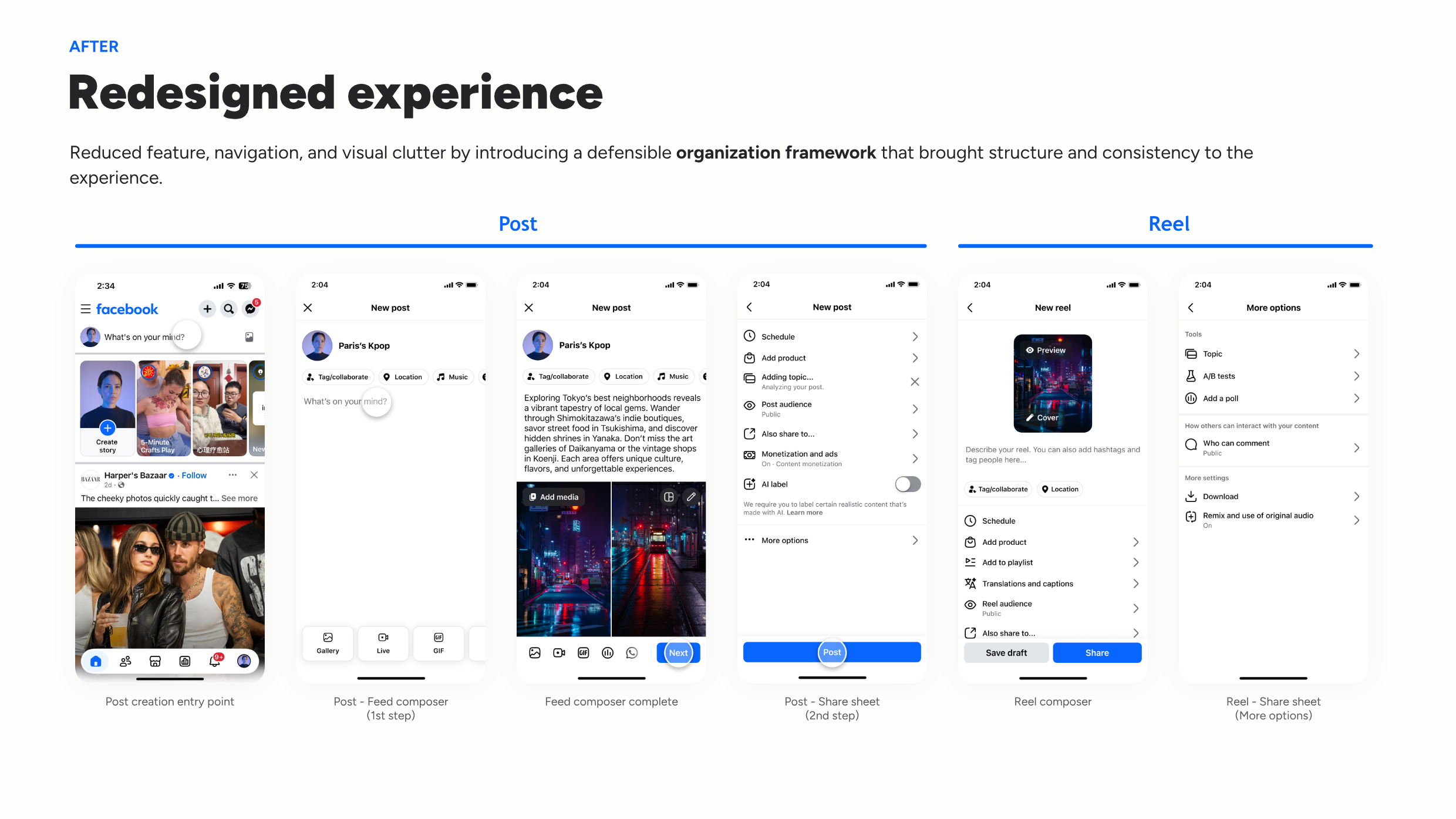
Reduced feature, navigation, visual, and content clutter across Posts and Reels.
A durable governance model
Made feature placement more repeatable across teams and future releases.
Findability was not enough
Balanced usability wins with funnel health and creator efficiency.
A media-first product strategy
Won alignment around a deeper model of how professional creators work.
Case recap
Frame systems, not screens.
I translated a visually framed brief into measurable product and governance problems.
Stay accountable after launch.
I used the regression to improve the product model instead of using positive research metrics to defend the work.
Create alignment mechanisms.
Frameworks, segmentation, and experiment logic gave cross-functional partners shared decision criteria.
Know when to redirect.
The strongest design move was not another screen—it was changing what the organization believed the composer should optimize for.